Concerto: Designing Safe and Accessible Entertainment Experiences
- asiya atcha

- May 21, 2021
- 3 min read
Updated: Jan 29, 2024

This project started as a response to a series of interviews I conducted with classmates from my design program. It was the middle of a our second lockdown from Covid-19 and we were all at home and dealing with the impact of the changes on our lives.
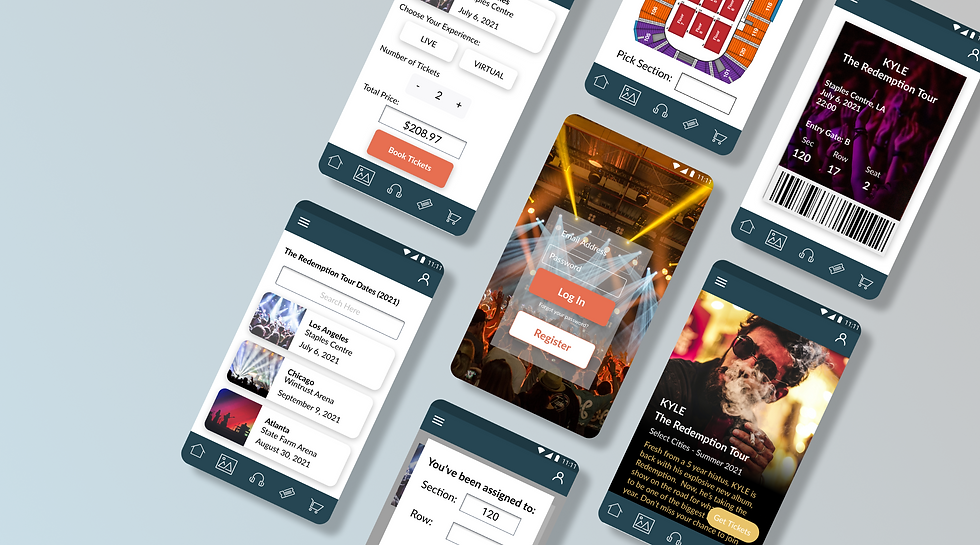
The idea of the app is to offer users a safe way to book in-person or virtual entertainment experiences. They select the area of the theatre where they want to sit and the system books them into seats that are socially distanced from other. On the day before the concert, the user gets a prompt to fill out a covid screening questionnaire, after which they can download their e-ticket. At the concert, their ticket is scanned and they are guided to their seats by an usher after one final temperature check.
For virtual experiences, the user selects virtual and then submits their email along with the emails of any guests. On the day of the concert, they are prompted to download the viewing app, which they can broadcast on their television screens. They are given a key code to a private virtual room where all their guests meet them. They can each watch the concert from the comfort of their own homes while keeping in touch with each other through the chat feature on the app.
The Interviews
I asked my interviewees about their emotions in respect to the pandemic, when and how they initiated changes in their routine in response to Covid-19, and the ways in which it impacted the quality of their life. You can see the interview questions and my resulting observations by clicking here. The insight that would guide my design was the observation by some participants that they missed going to concerts and other live events.
The User Personas and Empathy Maps.
I created two user personas based on the interviews. In my interviews I observed that there were two diverging approaches to Covid-19 lockdown, with one group feeling more comfortable to venture out and the second preferring to stay at home for the safety of other household members, or simply out of an abundance of caution. My goal was to develop an experience that could cater to both user groups. To help me understand both viewpoints, I created an empathy map for each one.


The User Journey and Scenario
The empathy maps in the previous section helped me to understand my personas' emotions as they navigate lockdown. I mapped out a potential journey for each one while simultaneously writing a scenario that combined the insights from my empathy map with the steps in my user journey diagram to create a cohesive picture of how my product idea would serve my user.


The Problem Statement
The app will modify the process of buying tickets for a concert to overcome challenges that music fans face when trying to attend cultural events due to Covid-19. Currently, music fans have no way of ensuring their safety at concert venues and are limited to virtual experiences which leave them feeling isolated from other fans. As a result, fans become bored and depressed. They disengage from the music scene and musicians lose an important revenue stream.
The Vision Statement
The app will improve the concert going experience so fans can attend concerts and enjoy themselves in a socially distanced live venue, or virtual concert with all safety precautions taken ahead of their attendance at the event. Placing safety protocols at each step in the booking process for live events and changing the way virtual concerts are structured to enhance audience participation will allow fans to feel safer. Designing with these goals in mind will make both live and virtual attendees happier with their participation in the music event and help them to feel engaged with the artist, making them willing to attend more music events and returning an important source of revenue to artists.
Eliciting Requirments
I used the scenarios I wrote to elicit requirements for an app. Each action that the user takes corresponds with a feature of the final product.

Sketches and Wireframes


Visual Design - Style Tiles


The Final Prototype
Finally, I built a prototype on Figma. The final design was supposed to take into account accessibility guidelines. I checked all the screens for colorblind accessibility, used hierarchies to make the app easy to read, and formatted buttons and input functions to be easy to tap.

Accessibility
Here are some of the steps I took to make my app more accessible:
made sure to check the minimal contrast ratio for body copy and larger headlines
created hierarchy following a logical structure for body text, headings and paragraphs
kept the layout consistent from screen to screen
grouped action and/or content elements together logically
made sure that navigation for all touch targets met Android/iOS requirements
kept main navigation panel visible at all times
clearly labelled all form fields
Some Problems
I had some problems with this app, in particular with accessibility. My app didn't meet the colorblindness standards for Able, a Figma plugin designed to check pages for accessibility requirements.


Comments