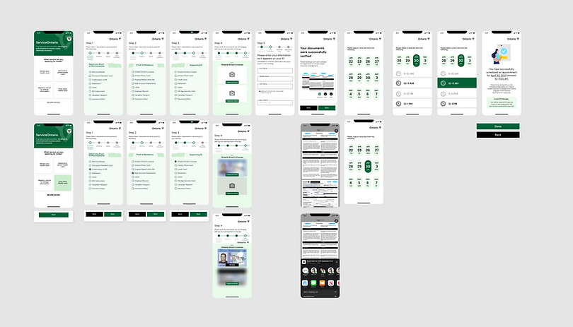
ServiceOntario App
An appointment scheduling app that eliminates many of the pain points of accessing government services. By helping users to feel prepared and well-informed for their visit, the app reduces stress and increases satisfaction.
My Role
UX/UI Design
Prototyping
Usability Testing
Team Members
Timeline
4 Weeks
Tools Used
Figma
Usertesting.com
Whimsical
Microsoft Teams
Going to Service Canada for any service is known to be a time-consuming stressful process. There are long wait times and people are often turned away for having the wrong documents, forcing them to come back and wait again.
My team and I worked in completely remote designs sprints to solve this problem by using a scheduling system. We designed a method to expedite the document review process and assigned time slots for visits, easing the hassle of dealing with a government agency.
Using the Design Sprint Toolkit

As we were in three person teams and given four weeks to solve the design problem, it made sense to refer to Google's Design Sprint Toolkit as a guide through the process. We used the following methods in each stage:
-
UNDERSTAND - Problem Statement, How Might We Exercise, and Affinity Clustering
-
DEFINE - Comparable Problem/Competitive Analysis
-
SKETCH/DECIDE - Crazy 8s with Sharing/Voting and Journey Mapping
-
PROTOTYPE - Wireframes and Medium Fidelity Prototypes
-
VALIDATE - Usability Testing and High Fidelity Prototype
The People Problem
People are concerned about waiting for long hours at Service Ontario locations, and having no idea how long they have to wait.
They are also frustrated when the documents they bring with them are rejected by required for each service, which results in them having to make multiple visits.

How Might We and
Affinity Clustering
We started by writing out HMWs individually before consolidating them on to one board to be mapped for affinity. Once we’d organized the most pertinent ones into groups, we took a dot vote. In this way, we landed on three HMWs for our product:
-
How might we ensure that clients have all the right documents prior to arriving at a Service Ontario location?
-
How might we simplify and consolidate the scheduling and application experience at Service Ontario?
-
How might we reduce or eliminate the wait time?
-
How might we prevent crowding or long lineups at Service Ontario counters?
Competitive Analysis
To develop context and define desired outcomes, we looked for similar systems in the scheduling and booking space. Because we were planning to design for desktop, we looked at mostly desktop applications. We started with a desktop application because we felt that it would feel secure and deliver the information with greater clarity.

Journey Mapping
We did a round of sketches in a Crazy 8s session and then had a shareback with voting on the best of each other's ideas. We took what we came up with and used it to create the journey map our users would follow in our design.

The Prototype Phase
In this phase we went through 4 rounds of iterating, from wireframe, to mid-fidelity, to high-fidelity before we settled on a design.
Round 1: Wireframe

Round 2: Medium Fidelity Prototype

The Switch to Mobile
In a round of sharing the prototype with our peers and professor, the feedback we got was that we should switch to mobile. This made sense because over half of internet traffic goes through mobile phones exclusively. It’s also efficient as it forces the designer to prioritize the most important information first, and leave everything else off the screen.
Round 3: High Fidelity Mobile App Prototype

Usability Testing
For our user tests, we presented the above prototype to three testers and gave them a structured script with specific instructions to follow. Their overall task was to sign up for an appointment to get a new health card at Service Ontario. They were then instructed to select, upload and verify documents and identification, download an application and choose an appointment time and location.

Results of User Testing

It's unclear to the user that three documents are required, one from each category
The screen is cluttered with text.
There is no visual hierarchy.
It's unclear how many steps are in the process, which can cause frustration.
This calendar is not complete. There is no information about the location.
The screen is text-heavy and there's no option to add the date to the user's calendar.
Visual Design - Style Tile

The Final Prototype


Menu opens up to allow users to select which document they will bring.
The completed section is in bold and a checkmark is added. The unfinished sections are in thin italic text to make it clear that they are incomplete.
The responsive stepper is added to all pages with descriptions under each step. information is consolidated and simplified.
The calendar is improved to show a full month calendar. Location information is included.
The information is organized inside cards and sharing and calendar links were added. Visual hierarchy is improved.