Social Sports App
A mobile app that brings sports fans together for intelligent and challenging conversations about their favourite sports teams and makes them the centre of the action.
My Role
Discovery
Audit
Competitive Analysis
UX/UI Design
Dev Handoff
Company
(Client Confidential)
Timeline
6 Weeks
Tools Used
Figma
I had the opportunity to work on the redesign of a platform that aims to put the power back in the hands of sports fans. The goal was to create a platform for sports fans to congregate and produce quality journalistic content about their favourite athletes, teams, and games.
Review of Existing Materials
Review of Existing Materials
When the team came to us, they had already been through the design process with another app development house, but they didn’t like the results and couldn't get their project off the ground. We inherited all their files, which included all the artifacts from their discovery (surveys, competitive analysis, personas, information architecture, and pitch deck) as well as relevant design files (UI exploration, style guide, logos, and high fidelity prototype.)
We started by reviewing all of the existing materials to accelerate our discovery. This way we wouldn't repeat the same mistakes of the previous development team and would avoid covering the same ground.
Heuristic Evaluation, Audit of Existing Prototype, and Competitive Analysis
The next step was a heuristic evaluation, an audit of the existing high fidelity prototype, and a competitive analysis
-
The results of our heuristic evaluation showed that the app lacked organization and hierarchy.
-
When we conducted an audit of the prototype, combed through the app design thoroughly, and called out each instance of a poor design decision.
-
In our competitive analysis, we avoided the sports apps that were covered in the first competitive analysis. Instead, we looked at the product's value proposition to identify apps that were doing similar things in other spaces.
-
To that end, we focused on written content creation apps like Substack, Medium, Reddit, and Quora. We looked at how each app allows users to publish articles, how the comment sections look, how articles can be found, and how profile sections look if available.


Moodboard and UI Exploration


The Final Prototype


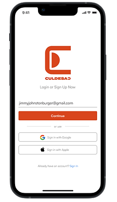
A simple login page with strong color cues and a clear branding. We also included easy sign up with Google and Apple accounts.
An infinite scroll newsfeed with thumbnails, article titles and interactive options to like or dislike as the user scrolls. We also added quick access buttons to allow users to edit draft articles and create a new debate on the spot.
A clevel profile page inspired by vintage baseball cards with space for the user's favourite sports teams and their own "stats" and bio.
Image driven articles with quick action buttons for the user to "agree" or "disagree" with a hot take.
Establishing a Culture of Open Communication and Collaboration
Early on, we made it a priority to establish a culture of open communication and collaboration with our clients. We understood that they had previously been through the design process and might feel drained and skeptical. To counteract this, we encouraged our clients to be as transparent as possible with us and to voice any concerns they had early on in the process. We actively listened to their requests, kept them informed at every step, and ensured that their inputs were reflected in our deliverables. By doing so, we aimed to create a smooth, frustration-free experience for our clients, one that would result in a viable product without having to repeat the process.